.jpg)
Imagine eating the same dinner every night. Over and over and over again. Literally the same meal 365 days of the year… forever! Let’s be honest, as much as you might like that food right now, you’d soon get bored of it.
So, is it the same for learning experiences?
You often hear conflicting information when it comes to this. Some people say micro-learning is best. Others are hardcore resources vs courses fans. Then there’s still those that say face to face will always be the most effective learning experience.
The debate in the digital space is often about changing the user interface. User interface, just so we’re all on the same page, is the design that allows users to navigate digital products. It’s what brings the user experience to life and allows someone to interact with it to achieve their goal.
Some will say that you need to keep the way users traverse a course the same every time, so they don’t have to ‘relearn’ how to do it. On the flip side, a large portion of people say you need to mix it up otherwise learners get bored of seeing the same thing over and over again. Eurghhh, which one is true?
Thankfully, you’re in the right place. We’re looking at some of the key user experience (UX) techniques often used by learning designers to the answer the ultimate question - do learners like change?
Keep your learning UX familiar
You’re surrounded by technology. Your phone, smart tv, computer, the boiler, heck even your doorbell can spy on you nowadays! One thing all of these devices have in common is that they come with a user experience (UX).
You can’t avoid UX, it's at the foundation of every product. Even your TV remote control gives you an experience (whether good or bad) when you use it. The users of your learning products will spend most of their time on other devices and sites, and will prefer your digital solution to work the same as all the other tech they already know. This is known as Jakob’s Law.
There is great benefit to familiarity. It allows us to download new apps and instantly know how to use them. And (also due to this factor) it allows users to achieve their goal of that product quicker and without having to use up precious working memory. As learning designers, it’s our job to allow the user to achieve their goal as seamlessly as possible. For us, that goal is them learning. If we use the existing mental models people have created from other technology, it reduces cognitive load and allows learners to focus more on the content; and in turn improve retention.
To help you keep your learning designs consistent and familiar, here’s a few magical mental models you can use in your solutions:
1. Menus should sit on the left as well as the menu icon. Burger menus or 9 dots are common designs used
2. State changes for functionality and progression:
- Hover states such as a change in colour or appearance when the user’s mouse is over an object to indicate functionality
- Tracking of progression such as accurate completion of sections or clearly highlighting which part of the course you are in
- Grey items indicate deactivated or non-function
3. Radio buttons, switches or checkboxes
4. Accordions or drop-down menus. These are typically matched with a + icon to indicate it can be expanded
5. Dot navigation (those little dots on the side or at the bottom typically on apps) to indicate the number of pages and progress
There are of course hundreds more. The key to utilising existing UX design is to reduce the amount of friction needed to achieve the user’s goal by using existing foundations. Now we’re not saying throw all creativity out the window. Not every design and layout needs to be the same, otherwise we’re back to eating the same food everyday scenario. Just remember, your goal is to reduce friction. Simply learn what are the elements of your design that you shouldn’t change.
So do learners like change?
With all of that in mind, we’d have to say the answer is NO.
Is change ever good for UX?
There is a time when ‘being different’ can be a useful UX design tool and this is called the Von Restorff Effect - when multiple similar objects are present, the one that differs from the rest is most likely to be remembered.
Thousands of years of evolution has given humans the ability to process a lot of information very quickly. What the Von Restorff Effect is saying, is that you can use colour, contrast or motion to bring more attention to particular parts of an interface.
Take a look at the below example. Here are two versions of a pop up that warn the learner if they’re trying to take the quiz before they’ve completed the whole course. Which one is more effective?
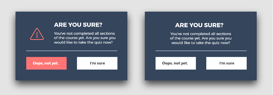
Right
The right version uses no contrast and both buttons look the same. Although it’s not the most complex instruction, you will actually need to use more cognitive processing to try and decipher what the differences are. This then uses more of your working memory and takes focus away from your goal (to take the quiz).
Left
The left version uses colour contrast to draw attention to the desired action we want - not doing the quiz yet. The option to take the quiz is still available but using this contrast, alongside the added warning icon and use of red, indicates a warning and makes it easier and quicker to process the difference in functionality.
A final use of the Von Restorff Effect law is motion. In learning courses you often see pictures, text and buttons all fade in or fly in at different times. Or timed buttons appearing to try and control the learner reading something before moving on. Not only does this create added friction for the learner, it slows them down and can cause frustration. The use of timed animations also creates confusion over the importance or hierarchy of items on the page. In this case, there’s too much contrast so we can’t decipher importance, therefore, we are programmed to ignore or forget that information.
So do learners like change?
In this case, the answer is YES…. But only when used correctly and avoiding too much contrasting change.
Making UX look good adds value
A challenge that often comes from stakeholders or senior leaders is ‘don’t pretty it up’ or ‘just get it live.’ But making your learning solution visually appealing isn’t a waste of time – it’s an absolute necessity. If you’ve never had an effective answer as to why it needs to look good – well worry no more, here’s a couple of proven theories to throw out there…
The Aesthetic-Usability Effect - Users often perceive aesthetically pleasing design as more usable and functional.
A study was conducted in 2010 by a phone company developing a new interface. Users were given two simulations that had the exact same functionality and interface. The only difference was the visual aesthetics of the designs. After surveying, results showed that although both had the same functionality, the more visually appealing design was rated as having better usability. On top of that, users were also able to carry out tasks quicker making them more productive at using the product.
As designers, we understand that our learning experience isn’t all about just looking good and being engaging; but how it works too. That’s not to say both can’t happen. Often, good design makes the product and experience more functional.
At the start, we touched on familiarity and how we shouldn’t divert away from already known pathways in existing technology, so does that mean we shouldn’t change the visual design? Not at all. This is where the change is needed.
Technology would be very dull to look at and use if it all looked the same. Different visual styles, layouts and media can be used; just make sure they work with those design elements that cannot change as per Jakob’s Law.
Fitt’s Law - the time to acquire a target is a function of the distance to and size of the target.
You need to consider how easy it is to complete a task, and how long it takes to complete by moving your finger (for mobile devices) or mouse (for desktop) to reach clickable items. Why?
Mobile User Experience
Hold your mobile phone in one hand. Now, using your thumb, try to reach all the different areas of your screen. You should find that the top, bottom and side are harder to reach. So, if you’re designing a mobile learning experience, you should always try to keep clickable items closer to the center of the screen. Phone menus do this very well as when you slide it up all your app icons move into the middle of the screen; they’re easier to reach and it’s quicker to perform the action.
Desktop User Experience
Most areas of a desktop screen are much easier to reach with the use of a mouse. So here the ‘time’ side of Fitt’s Law comes into play.
Let’s say you’ve just clicked a button to go to the next screen and that button was in the bottom right corner. Most people will place the back button in the bottom left. Which means if you want to go back to the previous screen, it will take you a longer time to complete that task as you have to move your mouse all the way across the screen. If you’ve done that, you’ll then need to replicate the same action to go forward again.
Although this isn’t drastic, it does cause friction to the user in completing their goal. If it’s taking longer and requires more effort than if it was closer, the user might just give up or not attempt that action. This is crucial when we know learners take in different knowledge at different speeds - they need fluidity to quickly and easily access content again. If we make this harder than it needs to be, or take more time, they won’t do it and therefore won’t learn.
So do learners like change?
When it comes to how it looks and the layout, the answer is ABSOLUTELY YES.
Think of your learners when designing your learning UX
When it comes to UX, implementing change is a double-edged sword. As we’ve seen throughout this blog, the answer to whether learners like change is both yes and no. So it’s your job as a designer to know when you can, and can’t, make changes in an experience to make sure it’s functional and usable - whilst most importantly reducing unnecessary friction.
The same goes for overall learning experiences, there’s no one type that is better than the other. It’s all about variety at the right time, using the correct solution, and knowing when change is needed.
When designing learning experiences there are a number of researched laws you can look to for UX and UI. If you stick to these it will reduce the amount of cognitive processing power on navigating, and free up more space on your user’s goal - learning something. Here’s a quick reminder:
Jakob’s Law: Users of your learning products will spend most of their time on other devices and sites, and they’ll prefer your digital solution to work in the same way.
Von Restorff Effect: When multiple similar objects are present, the one that differs from the rest is most likely to be remembered.
The Aesthetic-Usability Effect: Users often perceive aesthetically pleasing design as more usable and functional.
Fitt’s Law: The time to acquire a target is a function of the distance to and size of the target.
For more information on law and the psychology of good UX design we’d highly recommend reading ‘The laws of UX - using psychology to design better products & services’ by Jon Yablonski.
If you’re in the process of designing a new learning solution or strategy and would like a chat about what would work best in your organisation, reach out to Phill who will be happy to help you consider your options.
