
Ever tried making flatpack furniture? You know how it goes. Flicking pages back and forth, holding the booklet at all angles to see if it makes more sense - if it’s even in the right language that is. And then there’s always the mystery component that’s left over at the end. Where the hell does it go? Even Lego isn’t that bad, right? Well, except when you tread on it in bare feet.
Trying to make sense of the Web Content Accessibility Guidelines (WCAG 2.1) can feel a bit like a flatpack instruction book and a lot like treading on a sharp, plastic brick. It’s a confusing and painful experience because it’s not always clear what that principle or guideline really means when it’s applied in the real world.
At iAM we often get asked how accessible our content is, partly because we utilise animation in so much of our content; but also, because companies are starting to realise just how important it is for their workforce as the shift to digital content continues.
In this blog we’re going to look at the WCAG 2.1 guidelines and explain what you need to do to make your content as accessible as possible - with a few examples of how we do it too. So hopefully WCAG 2.1 will feel less like making flatpack furniture and more like building Lego. Oooo Lego! I’m going to make a race car…
The Accessibility Principles
The WCAG 2.1 guidelines set out the principles of accessibility requirements for websites, web applications, browsers, and other tools such as authoring tools. There are four key principles referred to as POUR.
- Perceivable
- Operable
- Understandable
- Robust
Oh dear, looks like we’re back to a flatpack furniture scenario again… What do those principles actually mean? Let’s take a look at each one to try and make sense of it.
Perceivable information and user interface
This means quite a few things. What we’re looking at here is:
- that there are captions and other text alternatives to media or interface items
- text can be read aloud with assistive technology
- it’s clear what buttons and icons do
- it’s easy to see and hear content
Wow OK, that’s a lot to take in and add to your design list but before you give up and go find some Lego, let’s break it down. This can be easier than you think but it is a chunky aspect to making content accessible. Let’s tackle the first two points.
All of iAM’s animated video and audio content get closed captions added (or subtitles you might know them as). For example, we’ve created a soft skills course where you listen to various responses and decide which one was the best. As well as closed captions, a transcript is included which is a text alternative to all voice over in animations and audio.
So that’s two things you can do to meet this principle but there’s still more. You should also add alternative text to any graphics or non-text based items such as icons, images and buttons. There are ways to write good alternative text but what you’re looking for is a clear written description of what it is, or does.
So if you have a menu button your alternative text could be something like “Click the menu button to open the main menu”. Notice I’ve said main menu not just menu. This is because sometimes there are sub menus inside courses where content might be broken down into 5 tips etc. Being able to clearly show which menu it goes to in the alternative text is important.
Let’s start looking at the other two points then – being clear what buttons and icons do. Now, this one I’m fond of because it’s also good UX design practice to make sure your user interface (UI) is clear. Where most people fall down is the use of iconography. Icons can be very subjective so you should always consider how beneficial they are to use in your UI. They are space saving and some are universal, like the ones below. You look at them and you know what functionality they would have instantly.
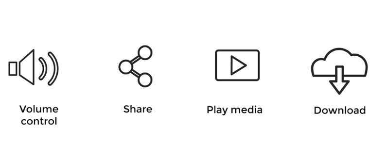
If you take the same functions above, but change the icons to the below ones, you can see they are no longer clear.
.png?width=848&name=Accessible%20(1).png) Now there’s much more that can be done in this section. But one topic we’ve not touched on is making sure content is easy to see and hear. For a full list of everything that can be done check out the Web accessibility website here, but there’s two important things I’d like to highlight:
Now there’s much more that can be done in this section. But one topic we’ve not touched on is making sure content is easy to see and hear. For a full list of everything that can be done check out the Web accessibility website here, but there’s two important things I’d like to highlight:
- colour is not the only way to convey information or identifying content
- text contrast levels
In learning design, an example that springs to mind for the first bullet point is changing the colour of an item once it’s complete. What you need to do is use a visual prompt, as well as colour. It would be fine to have a green tick (for example) as the icon clearly conveys the information of completion, but it wouldn’t be ok for just the text to be greyed out, or turn green.
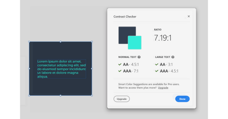
With the text contrast levels, this is about making sure the colour of the text is a high enough contrast to the background colour – and also isn’t obstructed by a busy background like photos. There’s some great tools out there that can help check the contrast, but personally I use a plug in on Adobe XD. There are free websites though like this one here. Below is an example of the XD checker and we’re aiming to get green ticks across the board.
Operable user interface and navigation
When thinking about accessibility, you need to remember that there’s a vast majority of people that do not, and cannot, use a mouse. This means you need to make sure your content is controllable by keyboard and in a logical way. Oh dear, better get learning some code, my race car will have to wait.
Well, before you go booking yourself on a javascript course, our authoring tool friends have got our back here. Most authoring tools have this functionality built in, you’ll just need to make sure that the order items tab in is correct, as it can depend on the order you’ve built it in (depending on the tool you’re using).
So the Lego pieces are starting to come together now but what other pieces do you need? Well, we get asked about these next two points regularly:
- Why do you give people the ability to control the videos? Can you lock playback so they can’t fast forward, rewind, pause, play and skip etc?
- Why don’t you lock sections of content until the person has completed the previous section? They might not complete the full course.
The reason we don’t do these things in our iAM courses and leave it fully controllable and not locked is twofold.
Firstly for accessibility reasons as people need to:
- have enough time to read and use the content
- find the content easy to navigate and determine where they are
The second reason is to give flexible learning. People shouldn’t be restricted to linear paths unless the content has to be linear. We often see our customers dip in and out of sections of the course, or use them alongside coaching, so locking the order would just add barriers to learning where they are not needed.
Understandable information and interface
If you’ve made it this far and not run off to find some Lego, great work! Ok, what’s next? You need to make sure your content is suitable for the largest audience possible, including when screen readers are used, and that content appears and works in predictable ways. A great example of this would be hyperlinks. We’ve all come to know that hyperlinks are blue text and underlined, so if you did that mid text like this but nothing happens when you click it, it would be confusing as the assumed action doesn’t happen.
Another key component is repeating user interface (UI) components. Things like if you have a back button in the top left, don’t move it to the bottom left suddenly or change it to an arrow button. This is also design best practice. Our Creative Director would be rocking in the corner of a room if we suddenly changed our button style mid-course (don’t worry Tom, we won’t!).
Robust content and reliable interpretation
OK, the wheels are about to be put on the race car, and it’s ready for the first “brum brum, whoooosh” test. The same goes for your learning design - you’re now at the final principle and everything has come together. Robust content is all about it being futureproof as well as currently compatible with browsers. This one will mostly be covered with the help of your authoring tool chums.
But as with all the best tools, there is still room for human error. That’s why you need to test your final courses on at least two current browsers to check everything works.
You’ll then have the green light to get started on the racetrack.
Accessible learning for everyone
There’s a lot of considerations and actions you need to take to make your content as accessible as possible, and hopefully this blog has given you some clarity on how to achieve that. At iAM we strongly believe that making accessible content is a must have, not a nice to have, as everyone has the right to learn. We’ve got checks that happen all throughout our production process and checklists to make it easier - we highly recommend doing this too so you don’t miss anything.
As with anything there are always ways to improve and make learning even more accessible, so we’re always reviewing and challenging ourselves on what we do. If you’re looking for fun and engaging content that can be used by everyone, why not try out our eLearning library for free for 7 days? Sign up for a free trial right here.
Now just in case you were interested, my Lego race car came out awesome, what do you think?
.png?width=507&name=Accessible%20Contrast%20%20(1).png)
For more information on how to make your content more accessible and the WCAG 2.1 guidelines, here are some helpful links:
Web Accessibility principles website
iAM Learning content accessibility statement
Adobe XD contrast checker plugin
.jpg)
